
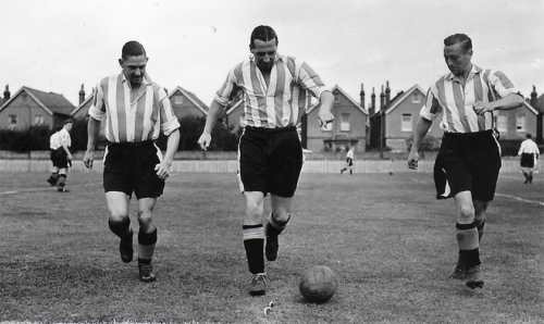
Last time we looked at the early years of the red and white shirts first adopted by Brentford FC in 1925. This early period can be summed up as practical and affordable. The shirts were in two basic styles; initially grandad collared and then formal shirt style ‘rugby’ shirts which were acquired and replaced when needed. The next period covered here will be 1945 to 1980 where style and technology would play a part in the development of the shirts worn by the club.
The post war years saw the gradual decline of the clubs’ fortunes and they were relegated from the First Division in 1947 and the Second in 1954.
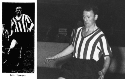
The club badge that had been adopted in 1938 disappeared from the shirts after the league resumed in 1945, and a change from white to red collars, with a white trim, occurred in 1946. The only brief change to the Home shirt was in 1956 when a supporter donated a white shirt with red collar for use in the new popular ‘floodlight friendlies’, although there is no record of this being worn in the league.
While Brentford and similarly financed teams stuck with the shirt and collar style, more successful and affluent clubs were making changes in the mid 1950’s.
Brentford were soon to follow suit.
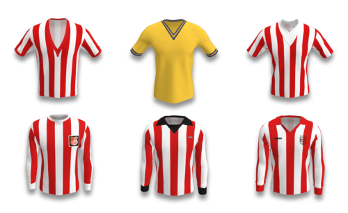
The Bees finished the 1957-58 season donning the ‘rugby’-style shirt that had been first adopted in 1933, but a new fashion was sweeping the football world; the ‘Continental’ V-neck t-shirt.
The club’s first attempt at this style resulted in a short-sleeved t-shirt with an extremely low cut ‘V’.
The previous shirts had commonly been worn with buttons undone exposing the chest, and it is possible that this low ‘V’ was to emulate this trend.
For the following season the ‘V’ was raised slightly and the centre stripe altered from white to red.
In a controversial move, and for the 1960-61 season only, Brentford adopted amber and blue for their Home colours.
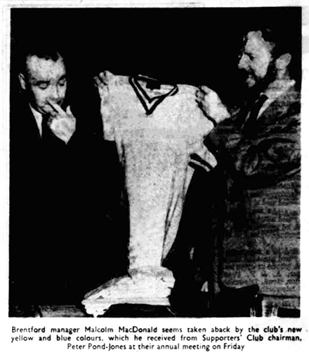
As he was presented with the new batch of shirts by the Supporters Association, Manager Malcolm MacDonald joked that it would cut the amount of time the Bees would have to play in their away colours to six.
Thankfully red and white remained as the Away colours. Under pressure from the fanbase the Board decided to change back to their now traditional Home colours for the following season
……but it didn’t improve the team’s fortunes, and they were promptly relegated to the Fourth Division for the first time.
An experiment with a thick white ‘V’ at the start of the 1962-63 season gave way in the new year to yet another new shirt fashion.
The round collared ‘Real’ style.
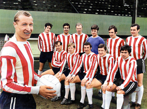
This was a long-sleeved shirt with a thick round collar and was worn in various stripe alignment and collar/cuff trim combinations until 1972.
In that final season a badge was added to the shirt for the first time since 1939.
This new addition honoured the clubs Middlesex roots with the county coat of arms in the top left segment, a beehive in the lower right, and stripes in the remaining areas.
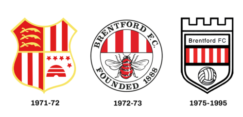
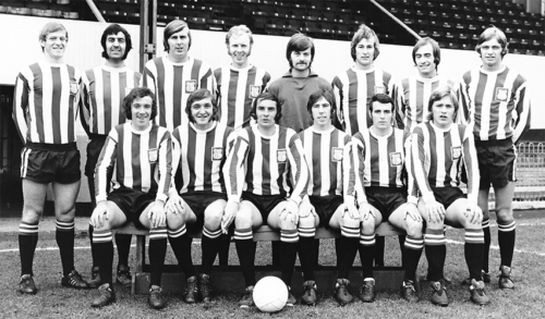
The team won promotion to the Third Division and a new shirt was introduced for 1972-73 which had a flat white collar and yet another new badge.
This was the first crest to adopt the Bee image and the text honoured the team’s alleged foundation year of 1888.
We were not founded in 1888!
Protracted correspondence with fan, Graham Haynes, took place.
Graham authored 800+ programme articles.
The club stubbornly accepted Graham was right.
The club was wrong. BFC was founded, in 1889.
The wrong shirt badge was quietly dropped.
Read about Graham’s battle with BFC
Umbro had supplied Brentford shirts for several seasons with their Aztec Jersey being worn in the late 1960’s.
![]() However, 1973-74 was the first season that their logo adorned the front. A black pointed V-neck and ‘flappy’ collar topped the shirt as the style embraced the 1970’s.
However, 1973-74 was the first season that their logo adorned the front. A black pointed V-neck and ‘flappy’ collar topped the shirt as the style embraced the 1970’s.
The 1975-77 version home shirt appears to have been made inhouse as the Umbro logo had disappeared, and yet another new club badge was sown on. This one was to remain until 1995 and was affectionately known as the castle badge.
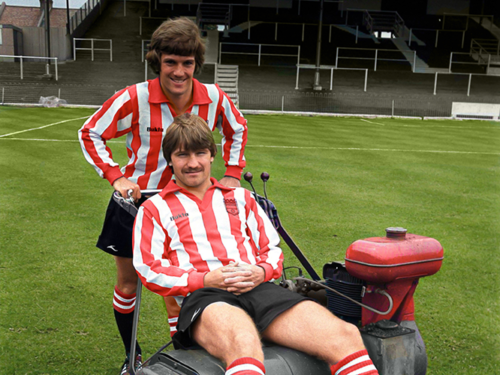
Bukta supplied the Brentford shirts from 1977-1980. Although they style didn’t really change during their involvement, the size of the stripes did.
The first shirt was similar to the previous inhouse version albeit with an open V-neck rather than filled, and the club badge was heat printed onto the shirt along with the Bukta Logo.
The beginning of ‘retail’
The 1979-80 version had a narrower stripe and for the first time was available to buy in the club shop.
Next time
We will continue into the 1980’s where shirt technology, the introduction of sponsors.
The concept of fan shirt sales would impact the designs of the Brentford red and white shirt.
Did you miss the first part of the story?
Brendan’s website has all you need to know about the history of Bees shirts
https://www.brentfordshirts.com/
Brendan Nevin